DataKind smallholder farms DataKit study: financial inclusion
A DataKind DataKit volunteer event, exploring SMS text data among smallholder farmers in East Africa
Introduction
In November 2025, DataKind hosted a DataKit event for exploring and modeling SMS text data collected from smallholder farms in East Africa. I volunteered, and got to work with others on a really interesting dataset!
Smallholder farming in Africa
Smallholder farms generally perform agricultural operations on less than a hectare of land (about 2.5 acres). Estimates in the early 2020s indicate as many as 33 million individuals in Africa are working on smallholder farms. Continued African rural population growth suggests that, in absolute terms, that number will continue to grow.
The farms are typically a mixture of subsistence farming (i.e. the farmers grow crops and raise livestock to feed themselves), as well as light commercial farming (for example, selling produce or livestock to others directly, or through local markets; in some cases, farming output may reach global-facing export markets). As much as 70% of the African food supply is generated by smallholder agriculture.
A complex mixture of tradition, job security, land laws, infrastructure constraints, and other challenges limit the potential for greater development and scope in African farming. One goal, for example, is to move more smallholders beyond substinence farming and into some degree of commercialization (i.e. farm-as-a-business). See for example this newswire article, which describes funding for African smallholder infrastructure improvements, such as irrigation systems and the wider availability of electricity.
The SMS text platform
The inter-farmer SMS text communication data was enabled and collected by the now-defunct organization WeFarm, which was launched by the organization Producers Direct in 2011, and officially closed in 2022 amid the Covid pandemic. WeFarm’s text messaging platform was fully launched in 2015. Smallholder farmers in Kenya, Uganda, and Tanzania could use the WeFarm service to ask each other questions about anything related to agriculture.
Once a farmer’s question entered the system, machine-learning algorithms searched for responders within the network with the greatest capacity to return a useful answer. A farmer could therefore expect several replies, by locals, within an hour or two. Replies from farther away, such as a neighboring country, might take up to 24 hours. Recognized languages included Swahili, Luganda, Nyn, and English. At one point several million farmers were utilizing the platform.
It’s worth noting that such platforms do have drawbacks. For example, concerns of farmers can be hyper-local: an answer from another farmer, even though they are “nearby” in some sense, may not be helpful because of hyper-specific conditions affecting the farmer posing the question. Platform uptake and consistency of use can be another obstacle.
Producers Direct, and the data
The DataKit event was sponsored by WeFarm’s creator, Producers Direct, née Cafedirect in 2009. Producers Direct retained the WeFarm SMS text database after WeFarm ended operations, which amounted to several million unique SMS texts. The database is proprietary and non-public. Producers Direct generously made the data available to those working on the DataKit event, and permission was granted to volunteers to make their consolidated analyses public. Feel free to check out Producers Direct if you find data and/or an analysis like this interesting!
Analysis overview and data refinement steps
The analysis was confined to,
- unique English language questions in the dataset: this amounted to some 2.85M entries, which, in turn, was a little over half of the unique texts in the dataset
- texts broadly related to financial inclusion: this includes texts related to credit and financing, banking, loans, market access for crops and livestock, crop and livestock pricing questions, and capital and startup questions
- the countries Kenya and Uganda: while there are other countries in the dataset, there are very few (on the order of 100s) English language texts from countries other than Kenya and Uganda; we treat the other countries as marked outliers in context, and do not include them
The analysis itself is generally constrained to visualizations and basic correlations, and may be useful for hypothesis generation. A majority of time available for the project was spent on refining and filtering the data, upstream of analysis. More specific research questions, better domain knowledge, and, especially, greater understanding of temporal activity surges and strong, approximately monthly oscillations in the data would be required for deeper analysis.
Summary of results
Some of the highlights from the analysis:
- texts related to market access and market prices:
- the market and price categories dominated the other 5 financial inclusion categories by an order of magnitude
- it’s likely the SMS platform provided a valuable service in the context of markets and prices and/or reflected an unmet need in the farmers for better market access and better pricing information–further study might help reveal if it was largely an unmet need, and, if so, how to better address it
- texts related to profits and startups:
- that texts of these types were next in frequency behind market and pricing texts suggests a not insignificant share of current or would-be farmers are actively looking for information on how to get started, and how best to sustain profitability; timely information and instruction in those areas may be important
- the “startup” category, also had a strong skew toward livestock-oriented questions (vs. crops), which may reflect the greater complexity of livestock farming and a greater need for information
- classical financial inclusion concerns:
- financial inclusion traditionally centers around banking and money services, to include credit and loan availability, insurance, and deposit accounts
- categories for money and loans were the least frequent among the data; this could reflect a “not there yet” aspect to the farmers–i.e. farmers engaged in subsistence farming may not have or see a need for these services yet–or this may have been a failure of the keyword filters to adequately capture all relevant texts
- Covid as a natural experiment:
- the onset of Covid coincided with spikes in questions about loans, and, more moderately, questions about prices and markets; monitoring these question classes, especially loans, might help identify economic distress in farmers
- oscillations in the text count time series:
- a large surge in texting activity over all question types (not just financial inclusion) in the second half of 2018 makes time series analysis difficult for that period; it is suspected that non-farming exogenous factors contributed, obscuring variations from farming-related causes; this would be a point of follow-up with ProducersDirect, for clarification
- roughly monthly oscillations over all question types (not just financial inclusion) over all years studied also made time series analysis difficult, overall; such large monthly oscillations tended to obscure patterns over longer time periods, and make discerning the impact of a one-off event, such as a country-wide weather event (drought, flood), difficult; these oscillations would be a related point of follow-up with ProducersDirect
- seasonal variations and evidence of planting / harvesting cycles, on roughly a quarterly basis were either minimal, or drowned out by the strong monthly oscillations in text frequencies across all financial topics; there is somewhat more evidence of planting / harvesting seasonality in Uganda, which, going by text topic counts, was more crop-oriented than Kenya, with Kenya more livestock oriented
Data processing pipeline
Before any analysis occurred, the data had to be processed. This comprised a substantial portion of the overall work.
Some of the texts in the raw dataset did have topic labels included–for example, a question having to do with tomatoes might have the topic label ‘tomato.’ Some of the texts in response to questions also had answer quality ratings. The texts were otherwise uncategorized. A processing pipeline was created to capture and classify questions relevant to financial inclusion from the total 2.85M, as follows:
- about 10-20% of the English words in texts had non-standard spellings
- this included logical abbreviations, like “plnt” for “plant,” likely un-intentional misspellings, like “rabbies” for “rabies,” and true non-standard spellings, like “sweetpotatoes”
- some effort was made to automatically catch and correct the most significant instances, especially as related to the project goals–so, for example, crop- and livestock names were corrected, if the spelling variants were prevalent enough in the dataset
- the spell check and corrections were not exhaustive, but the misspellings should not have otherwise significantly impacted the analysis at this level
- a generous set of keywords relevant to financial inclusion was created, using a mixture of research and domain knowledge
- keywords included, for example, ‘microfinance’, ‘deposit’, ‘market’, ‘wholesale’, ‘price’, etc.
- the intention at this stage was to avoid false negatives–i.e. when in doubt over relevance, avoid rejecting the text–further filtering downstream helped reduce false positives
- an associated regex search was performed, for an initial cut on the 2.85 million texts that resulted in 237K texts deemed tentatively relevant to financial inclusion
- topic modeling: a Gensim LDA model was applied to the spell-corrected texts, with 1- and 2-grams, to produce a handful of initial topics
- financial inclusion categories
- the topic modeling output from a sample of categorized texts was combined with human review to produce a total of 7 financial inclusion classes to categorize the 237K keyword-filtered texts
- to help with the next pipeline steps, the 7 classes were paired with representative texts from the actual dataset; the following lists the 7 topic category codes, an explanation, and an example question, for each:
- pce–for pricing related questions: “what is the price of medium goat”
- mkt–regarding market availability, and buying and selling items: “I have kienyeji eggs for sale. can i get buyers please”
- sta–for farming business startup-related questions: “how much capital do one need to start up pig farming as business”
- pft–for questions about future farming prospects and profits: “Which cash crop can i plant at this season make a good money”
- lon–for loan- and borrowing-specific questions: “I want to borrow me 500000 shillings to increase my business.”
- mny–for more general questions related to obtaining money for farming: “I need money from wefarm so as to improve productivity in my cows?”
- msc–for any texts not categorizeable by the other 6 categories: “What herbicide should i buy”
- LLM-bootstrapped classifier
- a two-stage classifier was constructed and run:
- stage 1: LLM classification prompt scripts were generated from the 7 category descriptions and sample texts; a random sample of around 4000 texts from the total 237K was taken; each of the 4K texts was put through a lightweight LLM, Claude Haiku 3.5, to classify the texts and create a set of “ground truth” labels
- stage 2: an SVM with RBF kernel was trained on the 4K LLM-labeled texts, with a raw classification accuracy of around 81% (i.e. number correct divided by total); the confusion matrix showed the best results for the ‘pce’, ‘mkt’, ‘sta’, ‘pft’, and ‘lon’ categories, with greater inaccuracies for the ‘mny’ and ‘msc’ categories; the fitted SVM then ran classification predictions on the remainder of the 237K texts
- while all 237K texts could have passed through Claude, at the time this was too expensive and resource-intensive to be practical
- a two-stage classifier was constructed and run:
The remainder of this document presents the analysis itself.
Financial inclusion question frequencies
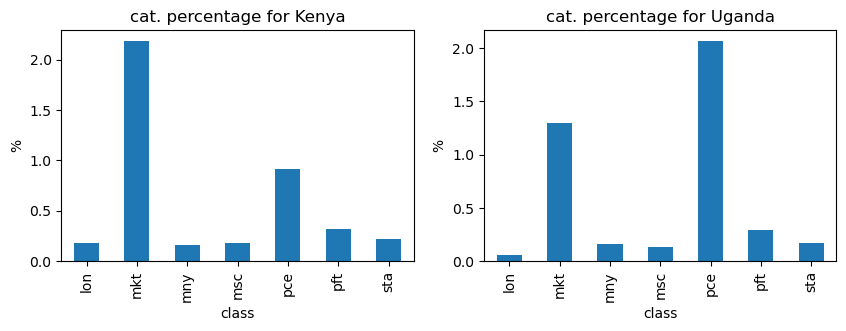
The following plots provide text counts over each of the 7 financial inclusion categories, separately for Kenya and Uganda. Questions about markets (buying / selling / access) and price / costs for products dominate the categories. The third-highest category involves questions related to profits.
General time series analysis
This section provides an overview of how the financial inclusion categories changed in frequency over time.
Overall activity for financial inclusion texts
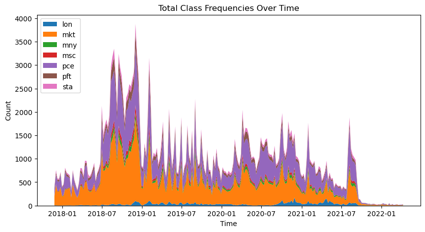
The following stacked area chart of classes as a function of time shows a few things:
- questions about market and price clearly dominate
- there is a high degree of cyclicity (regular spikiness)
- there is an overall surge in activity in the last 6 months of 2018
- at or around September, 2021, there is a big dropoff in activity–the data beyond this point may be of questionnable use for this analysis; most of the analysis below will focus on data prior to the 9/21 activity dropoff
Overall English language question and signup activity
The stacked area plot above shows many prominent fluctuations in the financial inclusion categories for the 3.5 year period of interest in the data. Let’s see how this compares with (a) the number of overall English language questions asked (not just those related to financial inclusion), and (b) the number of signups for the WeFarm SMS service.
For better viewing, the plot smooths both time series using a 15 day moving average.
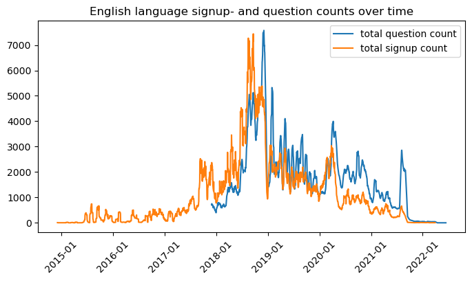
Overall, some of the major fluctuations in the financial inclusion data category frequencies, shown in the stacked area chart in the previous section, appear to be correlated with the overall question activity. For example, the large surge in activity in the last 6 months of 2018 appears in the overall question frequency, and signup frequency as well. The overall question activity in turn seems correlated with sign-up activity in the 2018-2022 time window. Separating out this macroscopic activity effect, in order to better see within-year seasonal variations in financial inclusion topics, is somewhat challenging.
One approach would be to normalize on the total question count. The drawback with this is that seasonal variations may see coincident surges in questions of other types (types beyond just financial inclusion questions), which could unwantedly mask seasonal effects in the financial inclusion categories.
Another approach would be to single out years in which the macroscopic activity effect is minimal. For example, the calendar year 2019 looks relatively stable with respect to overall question activity, and with respect to signup surges. It also stays clear of any effects of Covid on the agricultural sector, which are a little unclear after brief research–see for example a report on Kenya.
To best balance concerns over large, likely non-farming exogenous sources of variations in text activity, for the analysis below we’ll generally compartmentalize the data into calendar year units. While only focusing on 2019 might best represent text activity absent of large external disruptions, we’ll include one or more additional calendar years as well–this at least both for contrast with suspectedly “unusual” events, and to take advantage of more of the dataset, especially in cases where the unusual event is of primary interest, or the unusual event does not seriously impact some aspect of study.
Correlation analysis
Next, we’ll look at correlations among financial inclusion categories in the time series.
Inter-time-series correlations for the whole dataset
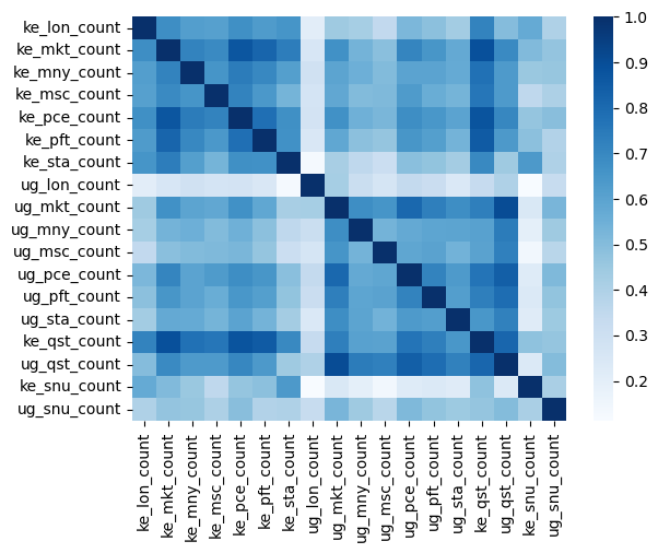
Taking the total question frequencies, the total signup frequencies, and the country / class counts for the dataset truncated at the 9/2021 dropoff, a correlation heatmap shows inter-series dependencies.
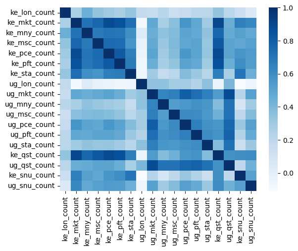
The heatmap shows several dependencies, or their lack:
- both the Kenyan and Ugandan overall text counts are fairly highly correlated (~0.6-0.8) with each of the financial inclusion category text counts; the least correlated, for both countries, are texts about loans
- both countries, Kenya and Uganda, show moderate correlations among the financial inclusion category counts, with Kenya having slightly higher correlations among financial inclusion category counts overall
- between countries, the correlation between financial inclusion category counts appear to be fairly low; the Ugandan loan category stands out as having very near 0 correlation with any of the Kenyan financial inclusion categories, though note the loan category does not have many samples
Testing time lags between signups and texting activity
WeFarm platform signup counts show moderate or low correlation with all categories. It’s reasonable to expect there is a lag between the time of signup, and when the user begins posting at normal levels. For example, if there were a large surge in WeFarm account signups on February 1st of some year, then we might expect a lagged surge in text activity, including in the financial inclusion categories, some days or weeks later.
This informal hypothesis was tested by introducing an intentional time lag of 10, 20, and 30 days to only the signup dates of the dataset. For each country, we then look at correlations between the (lagged) signup counts and the other financial inclusion category counts, and take the average correlation over all categories. This informal test actually showed a reduced average correlation for each of the 10, 20, and 30 day time lags. In numbers, the average correlation between the signup counts and the financial inclusion categories without any time lag was 0.4 for Kenya and 0.45 for Uganada. These correlation values dropped by 30% or more when introducing the time lags on the signup count field. This at least suggests the connection between signup surges and text activity may be somewhat complex.
In any case, the moderate to strong correlations between overall question activity and financial inclusion question activity raise some concerns about limitations on inferences from the time series data as-is.
At this point, it seems plausible there are some non-farming, exogenous drivers of general platform activity–both overall texts and financial inclusion texts. These could be in the form of advertising for WeFarm, general encouragement on the platform’s use, or perhaps holiday periods where platform use may be higher or lower. In general large oscillations–whether the surge of activity in 2018, or the ubiquitous presence of large, roughly monthly oscillations–are a recurring theme, as will be seen repeatedly below. This raises the question: how much variance in the financial inclusion topics, not least any specific financial inclusion topic, like texts about markets, is caused by non-farming exogenous drivers, and how much from more analysis-relevant farming-related drivers of interest?
Unfortunately, due to time and scope limitations during the DataKit event, that question was left open for any future analysis of the dataset. Further knowledge of regional and WeFarm operating specifics would be required, perhaps coupled with some degree of causal modeling.
Inter-time-series correlations, 2019 only
The next correlation plot shows the effect of filtering on just the year 2019. This does show slightly lower correlations bewteen the overall question counts and the financial inclusion topics, but correlations remain moderate.
With these considerations in mind, individual time series for country / class pairings will be examined.
Specific time series
This section will, in part, examine the time series for any seasonal or other intra-year variations.
Overall trends
First, a look at the country / class trends by year for each of the financial inclusion-related text types, with some basic plots.
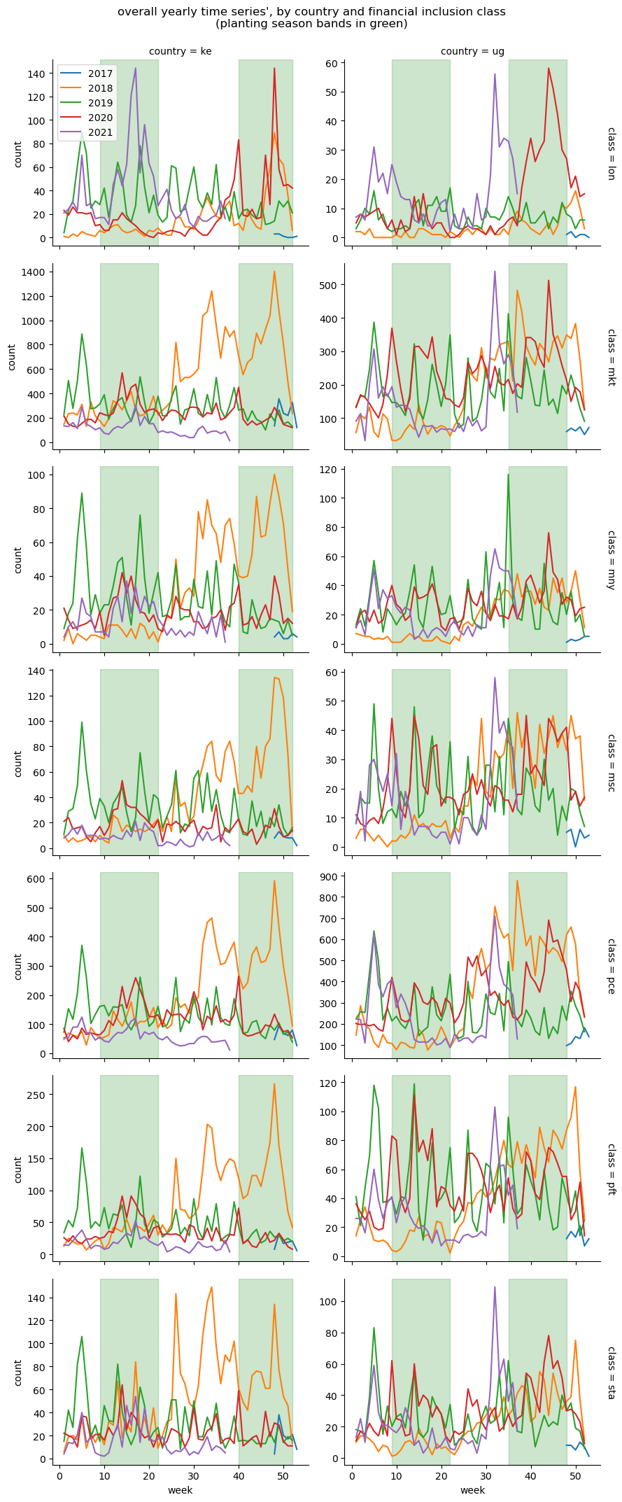
In general,
- all plots show strong, roughly monthly oscillations
- the second half of 2018 shows a large surge in activity; the fact this occurs across all financial inclusion classes again suggests it’s an external effect driving questions in general, reflected in the plots above of overall question activity, and overall signup activity
- Covid:
- some of the financial inclusion class plots, especially the loan class, suggest the negative economic effects of Covid, which began to affect the global economy in mid 2020, and lasted several years
- for loans, there are notable spikes in loan-related questions for both countries, in late 2020, and early- and late 2021; loan inquiries might generally be reflective of farmers in economic distress
- for markets and price, there are some indications of spikes in market- and price- oriented questions in Uganda, in late 2020 and late 2021
- seasonality:
- there is some evidence that Uganda displays some planting / harvesting cycle dependence in 2021–all financial inclusion classes show peaking in the harvest periods, and are relatively flat during the first planting season (Mar-May); this is supported by Uganda potentially being more crop-oriented, and therefore more planting / harvesting oriented, than Kenya
- in general, it is quite difficult to infer any strong crop-cycle seasonality off these general plots; the monthly oscillations, and the late-year surge in the case of 2018, dominate the plots.
To help understand the large monthly oscillations in the data, it may be useful to consider a single year that might be “typical,” and perform a basic time series decomposition on it. Since the second half of 2018 seems to have an anomaly in terms of overall question count and signups, and since 2020 and 2021 may suffer from the effects of Covid, the year 2019 will be considered “typical.” The most frequent classes are ‘mkt’ and ‘pce’. Kenya, ‘mkt’ and Uganda, ‘pce’ have their decompositions plotted. The seasonal period for these is the default 7 (days) for statsmodels tsa seasonal_decompose. These were also tried with a period of 30 days, and essentially gave the same results (a strong monthly cycle, this time in the “Seasonal” category, with “Trend” mostly flat).
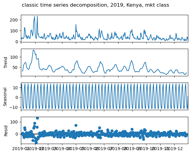
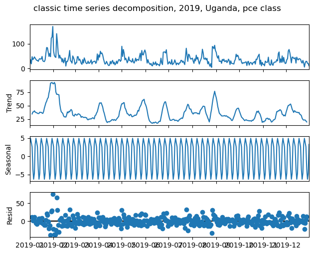
The predictive explanatory power of the models’ Trend+Seasonal components amounted to an r-squared of ~0.63 in both cases. Overall, there are strong weekly (“Seasonal”) and, approximately, monthly (“Trend”) cycles. The monthly cycles tend to peak around the start of each month. These oscillations may obscure any obvious, inter-month seasonal trends.
Plant / animal subgroupings
Next, the original topic labels from the raw dataset are used to split out more categories for financial inclusion related texts. Texts with topic labels that are all plants will receive the label ‘plant.’ Questions with topic labels that are all animals will receive the label ‘animal.’ All other questions–those with no topic labels or those with mixed topic classes–will be excluded.
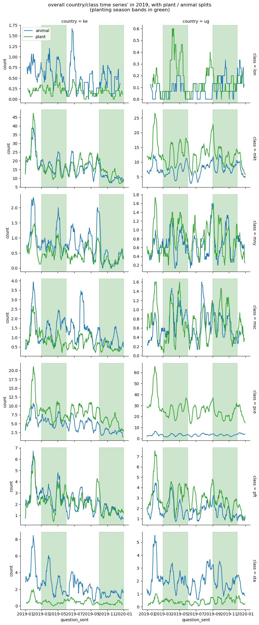
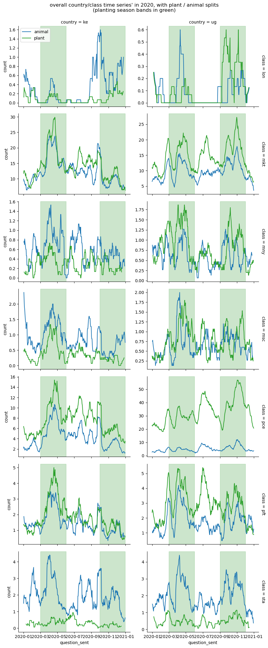
For the plotted years, 2019 and 2020, Uganda tends to be more crop-prevalent, while Kenya is somewhat more livestock-prevalent across all financial inclusion topics but the startup class.
In fact, for Uganda, in the most active text categories, “mkt” and “pce,” there is notably more text activity related to crops than livestock. This is especially true for price-related texts, which see crop-related texts more frequent by an order of magnitude than livestock-related texts. Some research indicates that, as of the early 2020s, the livestock contribution to agricultural GDP in Kenya was around 40%, while in Uganda, it was around 20%. So there is some causal support for the proportion of crop texts to livestock texts in Uganda being higher than that proportion in Kenya. However, given the marked difference between crop and livestock text frequencies in the price category for Uganda–crops being 5 or 6 times more prevalent than livestock–something else may be going on; some further possibilities are persented in the report’s conclusion.
For startup-related questions, livestock dominates the topics for both countries. This likely at least partly reflects the greater complexity and higher startup costs for livestock farming relative to crop farming. Feeding, healthcare, disease and predator management, all may contribute to the greater costs and complexity.
For planting / harvesting seasona trends, again, as with the general financial inclusion topic plots, it is difficult to reliably identify much seasonality among the large, roughly monthly oscillations. A major challenge with any statistical tests, for example, would be in explaining enough of the monthly variance to allow any true seasonal effects to show through.
Crop and animal specific question topics totals, by year and class
The next set of plots are bar plots, one for each country, year, financial inclusion category combination. We include a “full set” of years, 2018-2021. Each bar plot details the 10 most frequent topics among financial inclusion questions for that country and year. Bar heights correspond to the frequency of topic-specific texts for that country, year, and financial inclusion category.
For example, in 2018, in Kenya, the top 10 topics were (in decreasing order): chicken, maize, cattle, rabbit, pig, tomato, plant, poultry, potato, cabbage. We then consider, say, the loan category. We see there were about 20 texts in Kenya in 2018 in the loan category labeled with the topic ‘chicken.’ A bar of corresponding height is plotted for the ‘chicken’ label. And so on.
We add one additional feature to the bar plots. Consider the associated two-way contingency table for a specific country and year combination, where the 7 financial inclusion categories comprise the rows, and the top 10 topics for that country, year combination comprise the columns. The cells of the country- and year-specific contingency table amount to the frequency counts of texts for each specific financial inclusion category and topic label combination. We then compute the expected cell counts under the assumption of independence from the row and column marginals in the usual way–let (n_{i.}) be the row marginal frequencies, (n_{.j}) be the column marginal frequencies, and (n) be the grand total count, then the expected cell frequencies are given by,
\(E_{ij} = \frac{n_{i.}n_{.j}}{n}\)
For each country, year, financial inclusion category bar plot, we add black reference marks at the associated expected frequency levels. This may be useful for visually spotting unusual activity related to that topic and that financial inclusion class–i.e. bars whose heights differ significantly from the black reference marks derived from the independence assumption. Note we do not really have cause to expect cellular independence (if we did, we could directly run a statistical test, such as Pearson’s chi-square of independence)–the reference marks are moreso used to highlight unusual texting frequencies.
Notes and caveats:
- the financial inclusion classes have high skew toward market and price related questions, so the top 10 topics proportions will skew heavily to the topic frequencies in those two classes
- the topic ‘plant’ appears frequently. This as a topic label is somewhat ambiguous–both as a broad category, not crop specific, and also may have triggered off phrases like “How many tomatoes should I plant?”
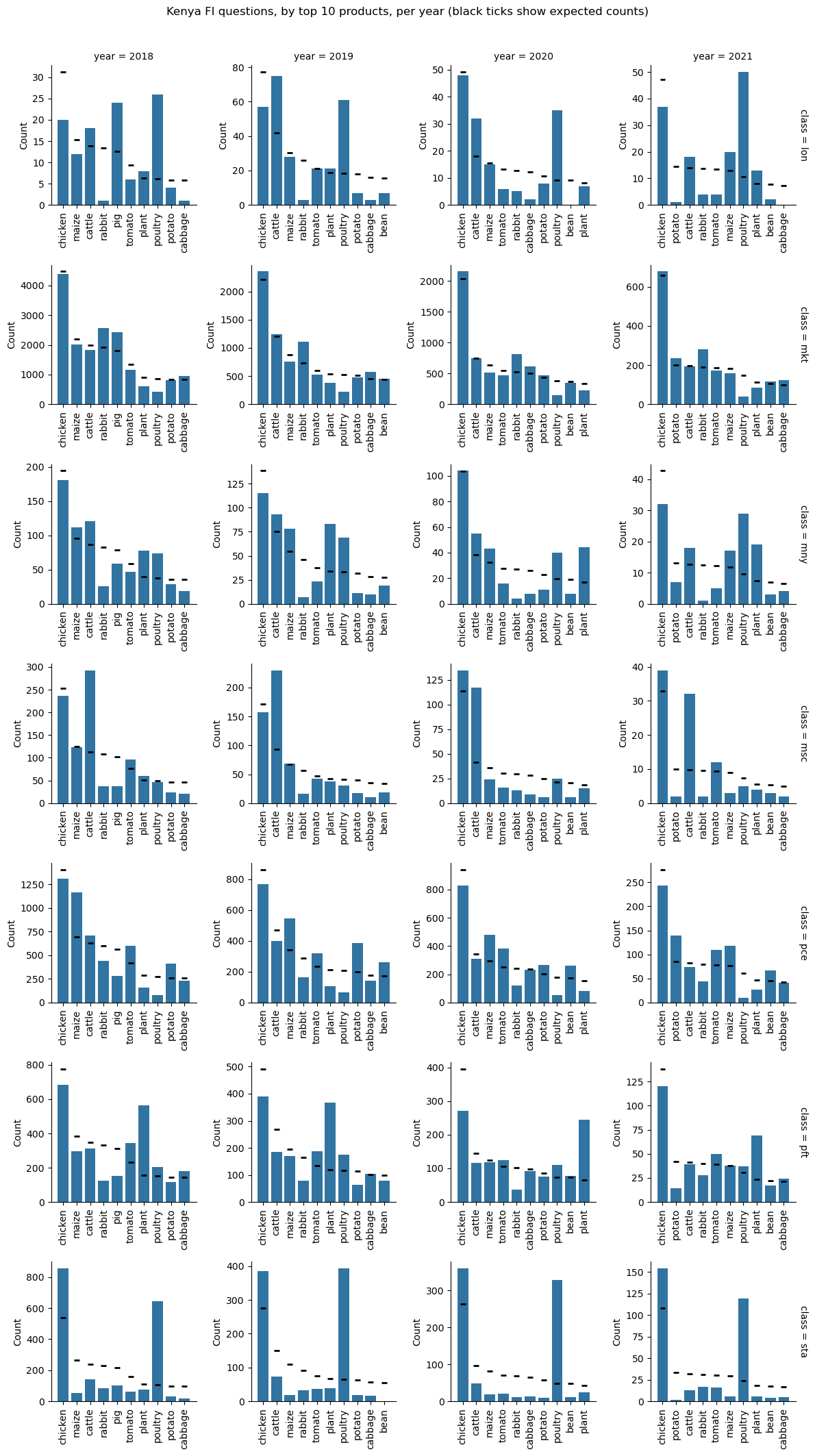
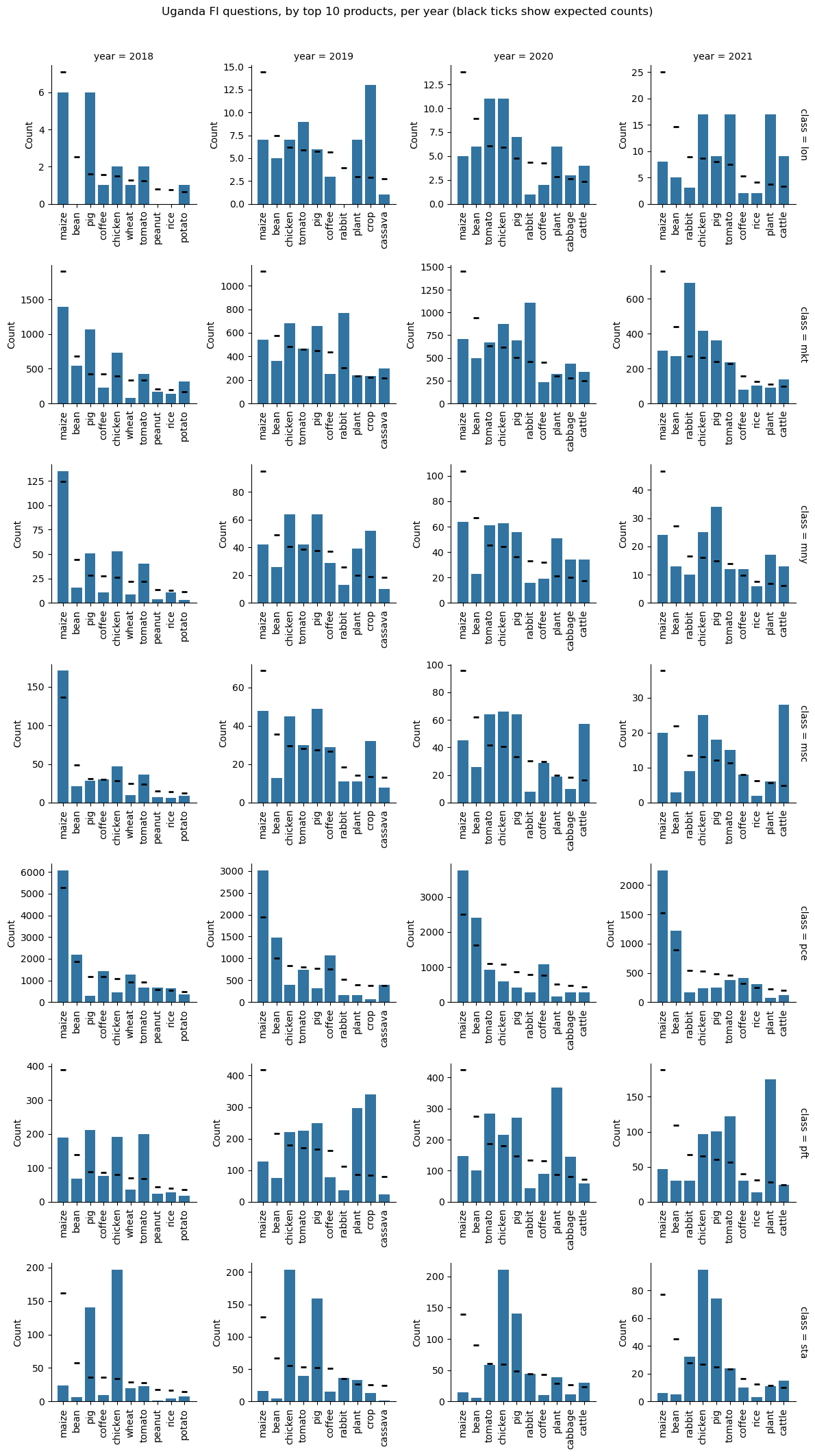
In general,
- loan requests seem more associated with livestock in Kenya, and more associated with crops in Uganda
- questions about startups are disproportionately skewed toward livestock; for example, chicken and poultry for Kenya, and chicken and pigs for Uganda
- pricing questions related to chickens dominate the Kenyan topics, while pricing questions related to maize dominate the Ugandan topics; this reinforces the general prevalence of livestock-related questions for Kenya, and crop-related questions for Uganda
- for the markets class, Uganda has disproportionate market-related questions about rabbits, and somewhat for chicken and pigs
More time series: crop and animal specific
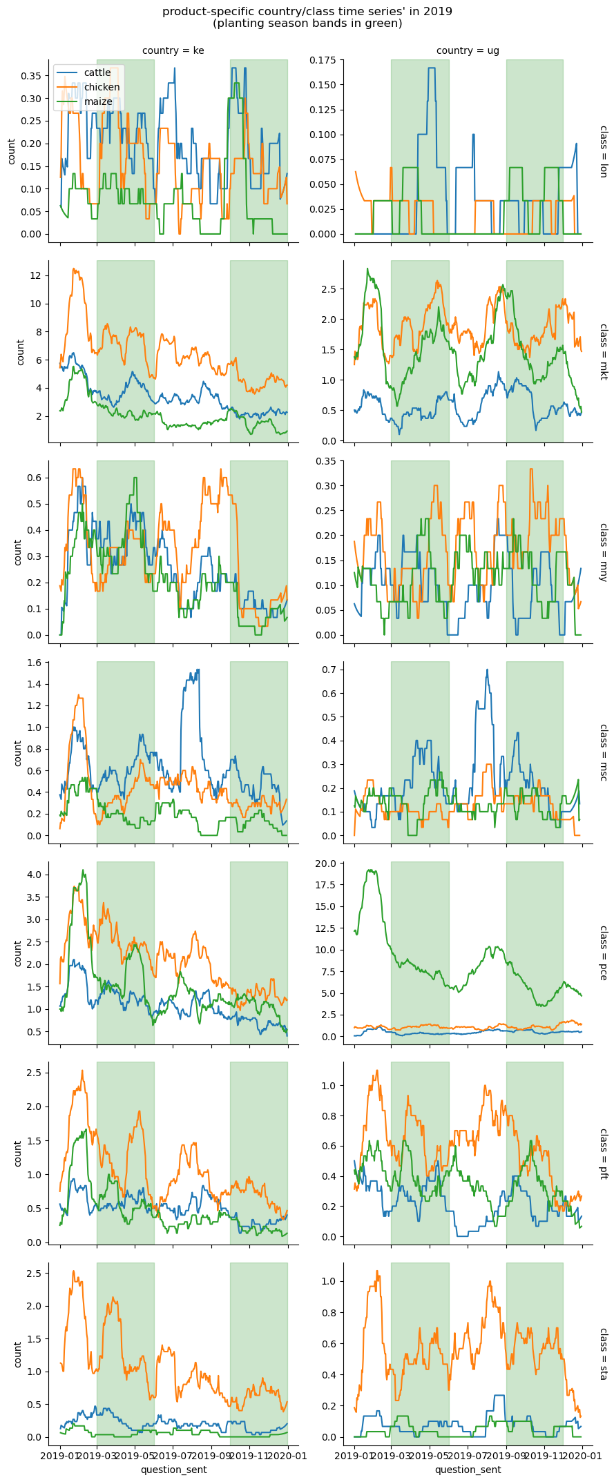
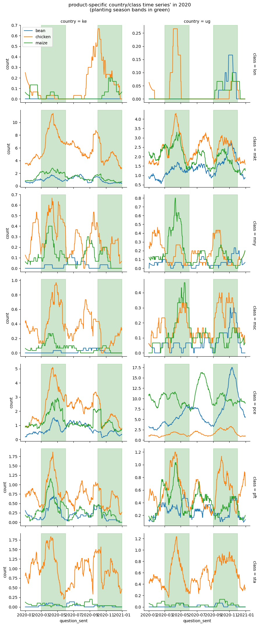
Next, consider the frequency of questions, by labeled topics, for particular crop- and livestock types. A rolling average of 30 days is used to smooth the plots.
Note, in general for these more granular selections, by the time the data is pared to country, class, and single plant / animal topics, the aggregated daily data gets fairly sparse–so in most cases, it’s difficult to draw conclusions for the plant / animal-specific time series. This might be more meaningful if constrained to country, class, plant / animal groupings that have more than some threshold of occurrences (over, say, a year)–for example at least 500 of each (or both). Accordingly, the product types will be restricted to the most common, these being maize, chicken, and cattle for 2019, and maize, chicken, and beans for 2020.
In general
- there is some weak evidence of seasonality for maize (under price), and chickens (under startups) in Uganda, with oscillations somewhat in sync with planting/harvesting bands
- overall, for startup-related questions, reflecting the bar plots above, questions related to livestock (chickens) dominate
Conclusion
Again, this analysis is relatively basic, and more suited for general discussion and hypothesis generation.
One standout was the predominance of text activity related to markets and pricing information. This suggests that availability of markets is important for the farmers. Difficulties in getting crop yields to market in a timely fashion may result in unfortunate losses–especially for more perishable produce items. And having access to reliable pricing information may help farmers better plan ahead, as well as immunize them from middlemen seeking to take profits as intermediaries.
Relatedly, we saw the pronounced crop-related dominance of text activity for Uganda in the years 2019 and 2020, relative to livestock texts, especially in the markets financial inclusion category. What might explain this? Though, again, Uganda does show more crop activity as a percentage of GDP than Kenya, that may not fully explain the difference. Were there crop surpluses? Are crop markets more difficult to find or access in Uganda than livestock sales points? Were there other urgencies that might have caused a rush to market for Ugandan crop farmers?
In both countries, for 2019 and 2020, we also saw pronounced dominance of texts related to livestock over crops in the financial inclusion “startup” category. Again, an obvious reason is that livestock farming is more complex than raising crops. What else might this dominance indicate? Are the majority of texts from would-be farmers, curious about beginning livestock farming? or established crop farmers taking up an interest, or expanding existing livestock holdings? What information is available to the farmers for livestock farming–are there gaps in information availability? Is there, perhaps, a lack of ready veterinary care? Could the predominance of startup questions for livestock be caused by disease outbreaks at the time? or a sudden surge of interest because of job displacements, with livestock farming perhaps perceived as yielding a more immediate profit, and, in some cases, requiring less land?
Though the frequency of loan questions was lower than most of the other financial inclusion categories, we did see an increase in loan texts around the time Covid began affecting Africa at scale (from May, 2020, onward). Do loan-related texts reflect farmers in distress? or is this moreso would-be farmers inquiring about getting started? If there is a “distress” component, or a way to filter for the distress cases, a microloan program could simulatneously benefit farmers, and be useful for monitoring and data collection purposes: regions or agricultural areas with higher microloan requests might indicate areas in current or pending distress. Data has value, and the cost of an appropriately calibrated microloan program may be more than compensated by the data collected.
And for other classical financial inclusion keywords, why were texts seemingly muted? For access to banking and credit markets, including digital banking services–is the need not that great? or, for example, if the data truly reflects a lack of participation and interest, would providing these services stimulate demand for them?
AI / LLM use disclosure
The DataKit event, for the author at least, was still early days re AI and LLM use. There was obvious use of LLMs for text labeling on the subsample of approximately 4000 texts. LLMs were also used to help with some of the plots–these rendered with Python and Matplotlib. The vast remainder of the work was performed without AI assistance.