Rodent sightings under the New York City 311 complaint system
Introduction
For this post, a clustering analysis is applied to rodent sightings reported through the New York City 311 complaint system for the year 2019. The analysis will be confined to some of the highest density areas in New York City’s five boroughs, that of mid- and lower Manhattan, from a few blocks north of Central Park to the southern tip of the island.
One of the most obvious questions we can ask about the reported rodent sightings is their distribution. Are the sightings consolidated to certain areas? or are they more spread out? Relatedly, what areas have the highest concentration of rodent complaints? Such a study might be useful, for example, for guiding targeted mitigation efforts.
The data for the sightings was first downloaded from the NYC database website for the year 2019 in its entirety, then uploaded to a local PostgreSQL server. To only select relevant rodent sightings, several filters were used. The 311 data contains both a complaint category and a complaint description. Since the complaint category of “rodent” could include pigeon sightings, filtering included selecting only entries with terms “mice,” “mouse,” “rodent,” or “rat” in the description field. The 311 system also allows reporting conditions that are merely likely to attract rodents (versus an actual rodent sighting). So filtering also attempted to exclude such reports. The total SQL query was,
SELECT  id, created_date, closed_date, agency, agency_name, complaint_type, descriptor, status, due_date,
resolution_description, location_type, incident_zip, address_type, city, borough, latitude, longitude
FROM calls_311_2019
WHERE (complaint_type ILIKE '%rodent%') and
((descriptor ILIKE '%rodent%' or
	 descriptor ILIKE '%mouse%' or
	 descriptor ILIKE '%rat%' or
	descriptor ILIKE '%mice%')
and NOT (descriptor ILIKE '%condition attracting rodents%'));
The resulting table was saved to a CSV file and transferred into a Python Pandas dataframe for the analysis. The primary fields used were the reported incident’s latitude and longitude. To get an initial idea of the distribution, a simple scatterplot was created with a marker at each sighting’s lat/long. The Python mapping utility used was Folium, which works in conjunction with JavaScript and a web browser and has a very useful and simple interface for this type of scatterplot.
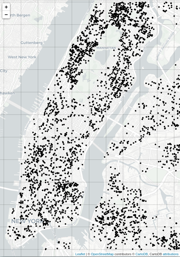
Figure 1: Reported rodent sightings in and around mid- and lower Manhattan for the year 2019 from the NYC 311 complaint database.
Initial exploration and agglomerative clustering
Looking at the map of Figure 1, it would be prudent to first check the sightings against a null hypothesis of uniformity. If the distribution is statistically no different from a uniform distribution, a clustering analysis risks providing no real new information. The test for uniformity was accomplished using a relatively low power Chi-square test on a one-way contingency table with entries corresponding to sighting frequencies in a grid over the relevant areas of Manhattan. For the grid, lower- through mid-upper Manhattan was portioned into equal-sized, disjoint lat/long boxes. Any box containing areas of water (the Hudson, or the East River), or Central Park was eliminated, resulting in 24 relevant boxes in all. Otherwise, the boxs’ placement was relatively arbitrary, so we’ll assume this does not interfere with the test. This resulted in the following counts per box, in no particular order:
[59, 134, 62, 98, 87, 196, 170, 64, 86, 69, 127, 49, 45, 54, 21, 65, 22, 87, 104, 177, 129, 205, 283, 274].
Python’s scikit-learn was used to perform the basic Chi-square test. The resulting p-value was infintesimal, at 4e-217, allowing rejection of the null hypothesis that the distribution is uniform.
Consulting the map of Figure 1 again, there are areas where the rodent sightings are fairly tightly massed, and areas where the sightings are more spread out. To rigorously quantify areas of high density, hierarchical clustering was used. The agglomerative clustering algorithm from scikit-learn was utilized for the task. The algorithm requires the assignment of a distance metric, or so-called linkage, to quantify the distance between two arbitrary clusters. The algorithm works recursively, by finding the two closest clusters under the metric, declaring them a single cluster, then repeating over all the clusters. In this case, the metric used, $d(c1,c2)$, was the Ward linkage, which measures the difference between post- and pre- intra-cluster variance. The Ward metric is especially good for consolidating points into spherical clusters. Since we’re only interested in the densest areas of rodent complaints, we can set a distance cutoff, $c$, for the agglomeration algorithm, where if $d(c1,c2)>c$, the clusters are not glommed. The distance cutoff in this case was $c=0.005$, tied to the lat/long units and tuned to give reasonable balance between clusters too large and amorphous on the one hand, and too small to have enough instances within them (say, 10 or more) to warrant attention.
Before we do the clustering analysis, a final important consideration is what to do about serial complainers. We define a serial complainer as more than one rodent complaint coming from the same lat/long position in the dataset. Serial complaints raise several questions: was the problem addressed after an initial complaint, then only to recur? or were NYC services slow to respond to the initial complaint, causing multiple complaints for the same rodent manifestation? or perhaps was the rodent problem so bad, multiple complaints reflected its severity?
Each of these possibilities really deserves its own treatment. For instance, the time period between the serial complaints could be checked–days? weeks? months?–and could help differentiate the cases. This analysis does not attempt to address such possibilities. We’ll simply assume serial complaints arise from the same rodent manifestation, regardless of its severity. Under that assumption, serial complaints will be reduced to count as a single complaint–i.e. in the case of multiple complaints at the same lat/long, we’ll only register them as one complaint. This was accomplished using pandas’s groupby on the dataframe.
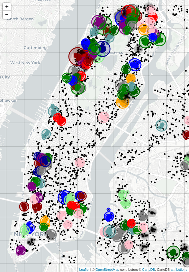
Figure 2: Agglomerative clustering performed on rodent sightings, using the Ward linkage with a distance cutoff of 0.005 (in lat/long units). Only clusters consisting of ten or more sightings are plotted. Each cluster received a random color for its elements. A same-colored circle was added, its center at the cluster's centriod, with its radius proportional to the number of sightings in that cluster.
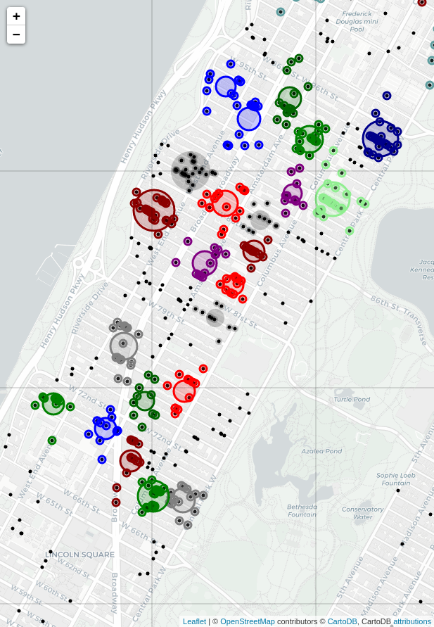
Figure 3: Agglomerative clustering, a closeup of the Upper West Side. The procedure was the same as that of Figure 2.
The effect of the Ward linkage is evident from the resulting plot, especially in the closeup of the Upper West Side (just west of Central Park). Sightings have been effectively broken up into high-density spherical clusters. This is a good compromise between larger, misshapen clusters that risk including low-density areas, and little or no clustering at all. A little research revealed (see this Wikipedia article, for example–there’s actually a lot of stuff online about NYC rodents!) that New York City’s rats tend to live in colonies numbering 30-50. They usually live within a few hundred feet of their food sources, and in their lifetime generally stay within a block or two of where they were born. Since the high-density clusters on the map cover a few blocks at most, it’s possible they reflect the activity of a given colony, perhaps an especially vigorous one.
Kernel density estimation
Another obvious approach for visualizing the relative density of rodent sightings is some form of heat map. For example, a convolutional approach might be used, smoothing the nearby sightings at any given point via multiplicative weighting by a Gaussian filter. Kernel density estimation (KDE) accomplishes this. The kernel of the KDE is typically some smooth function in the instance phase space, usually thought of as a continuous pdf. The phase space instances are treated as delta functions, and a convolution is performed. This is the same as centering the kernel function at each instance in the phase space, then adding the resulting values at each point in the phase space and normalizing. This results in a scalar pdf over the whole phase space, with scalar value rising in proportion to the local density of instances. This process was applied to the rodent sightings, using a Gaussian kernel with Python’s scipy package.
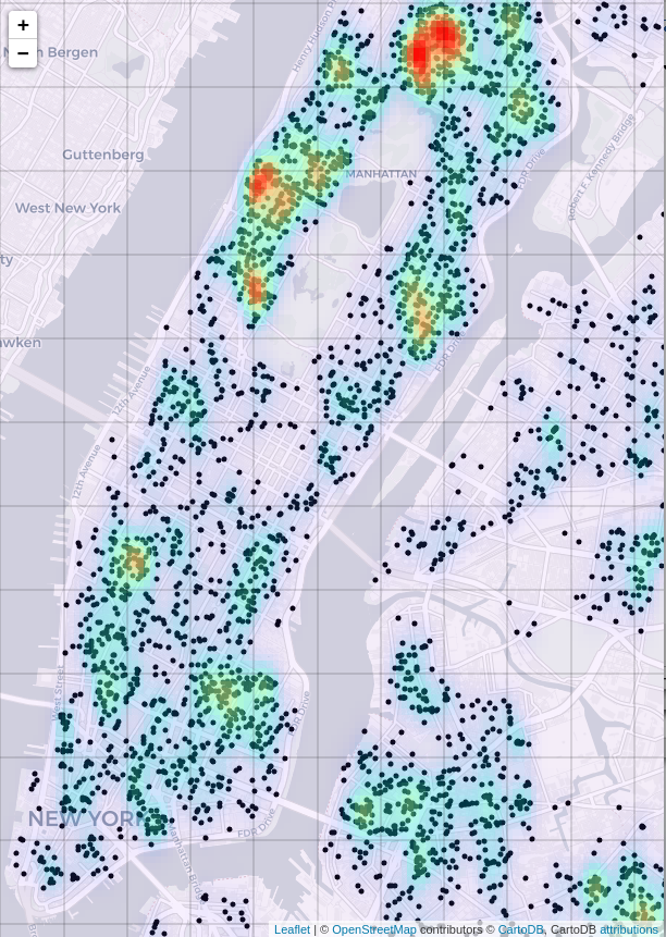
Figure 4: Rodent sighting heatmap, created with a kernel density estimate.
The result is useful for identifying general hotspots, notably on the Upper West Side, and in southern Harlem (just north of Central Park), but it lacks the specificity of the agglomerative clustering approach. This could be somewhat improved by applying a smaller-sized kernel. This is effectively accomplished by allowing scipy to auto-size the kernel after zooming in on the Upper West Side.
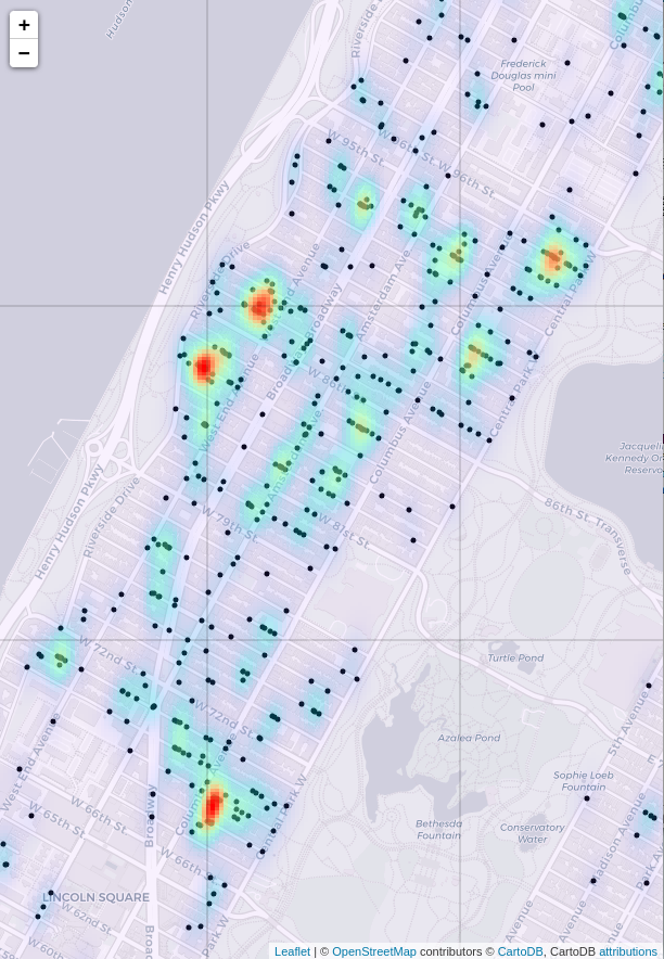
Figure 5: Rodent sightings, zoomed in on the Upper West Side. The KDE is at a finer resolution (smaller kernel).
Compare the result with Ward clustering in Figure 3. The two maps show very similar high-sighting regions. The agglomerative clustering plot perhaps shows more high-density regions overall, but the heat map of the KDE is smoother, and better at highlighting very high density regions. The two approaches could be used in conjunction.
In general, some areas stand out for the high density of complaints. One area in lower Manhattan is the East Village. It turns out the East Village is a favorite place of foodies, reflecting an expected association between rodent densities and the density of food sources.
Discussion
At this preliminary stage of analysis, it would not be safe to assume the areas of largest clusters, or areas densest with the most clusters are necessarily “worse” re rodents. It’s possible in those areas with a high density of reports that people are more sensitive to the presence of rodents. It’s also possible that in high density report areas there are more people out and about, able to spot a rodent–this versus areas where there is less foot traffic and a sighting, all else being equal, is less likely. It’s also possible there are fewer places for rodents to hide in the high density complaint areas.
One would expect the reality on the ground to be somewhat complicated. One could plot the complaints against overlays of local population density, or high-rise density, or restaurants (or other structures known to appeal to rodents), or perhaps areas where trash pickup is less diligent. It’s also plausible that there is a certain amount of regression to uniformity in the density distribution. A high number of reports in a concentrated area might be more likely to bring more pest control measures to bear on the area, creating a dynamic that naturally pares down high-density outliers. The net effect would be a density map in constant flux, as high density areas crop up, to see increased mitigation efforts, which might force the rats to relocate to a different area, to repeat the cycle in the new location. Also considering there also may be a certain amount of inter-season variation, one might study the map over several years, factoring by season–if high density areas remained so over the years, that would give more confirmation rodents were a true problem in that neighborhood, and mitigation efforts could be stepped up in that area.
As a final note, just as with my NYC noise complaint post, an analysis of this type has already been done. (For learning purposes, I try to avoid looking at other analyses until I finish my own.) It turns out the linked analysis is quite thoroughly and professionaly done, and worth reading if I’ve piqued your interest in New York City rodents! The author, Vanessa Mateus, also used a kernel density approach for part of their research. Their report also includes a distance analysis of rats’ favorite structures (e.g. food-related businesses, business districts, and parking lots).